Unveiling “The Fluidity of Being”: A New Abstract Impasto Art Collection
The Introduction Art has always been about more than just capturing a likeness; it’s about
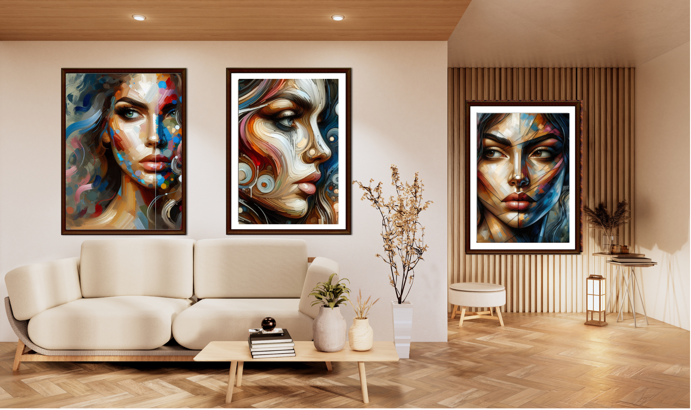
Art has always been about more than just capturing a likeness; it’s about capturing a feeling. Today, I am incredibly proud to unveil my latest collection: “The Fluidity of Being.”
This series of nine digital artworks is an exploration of human identity deconstructed. Moving away from photorealism, I wanted to dive deep into texture, color, and emotion. By utilizing a digital impasto technique—mimicking thick, heavy oil paint—these portraits feel tactile, raw, and alive.
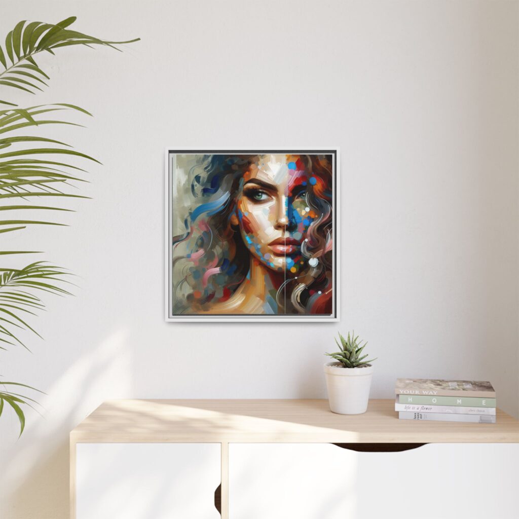
The core theme of this collection is the conflict between the structure of the human face and the chaotic flow of our emotions. We often hide behind a mask, but this collection tries to melt that mask away.
You’ll notice a recurring color palette throughout the series: deep crimsons representing passion, electric cyans representing energy, and earthy ochres representing our grounding.
While every piece in the collection stands on its own, they interact with each other in fascinating ways. Here are a few highlights from the series.
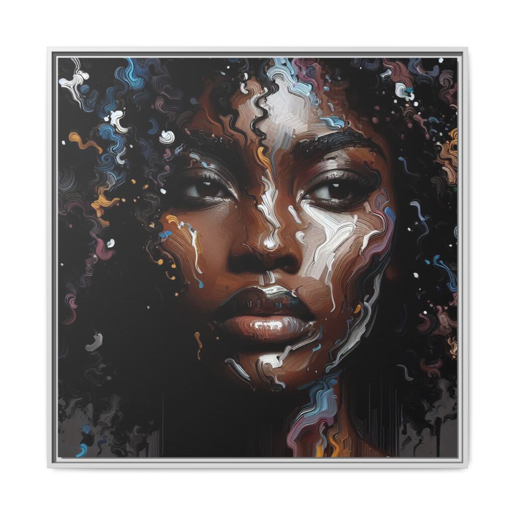
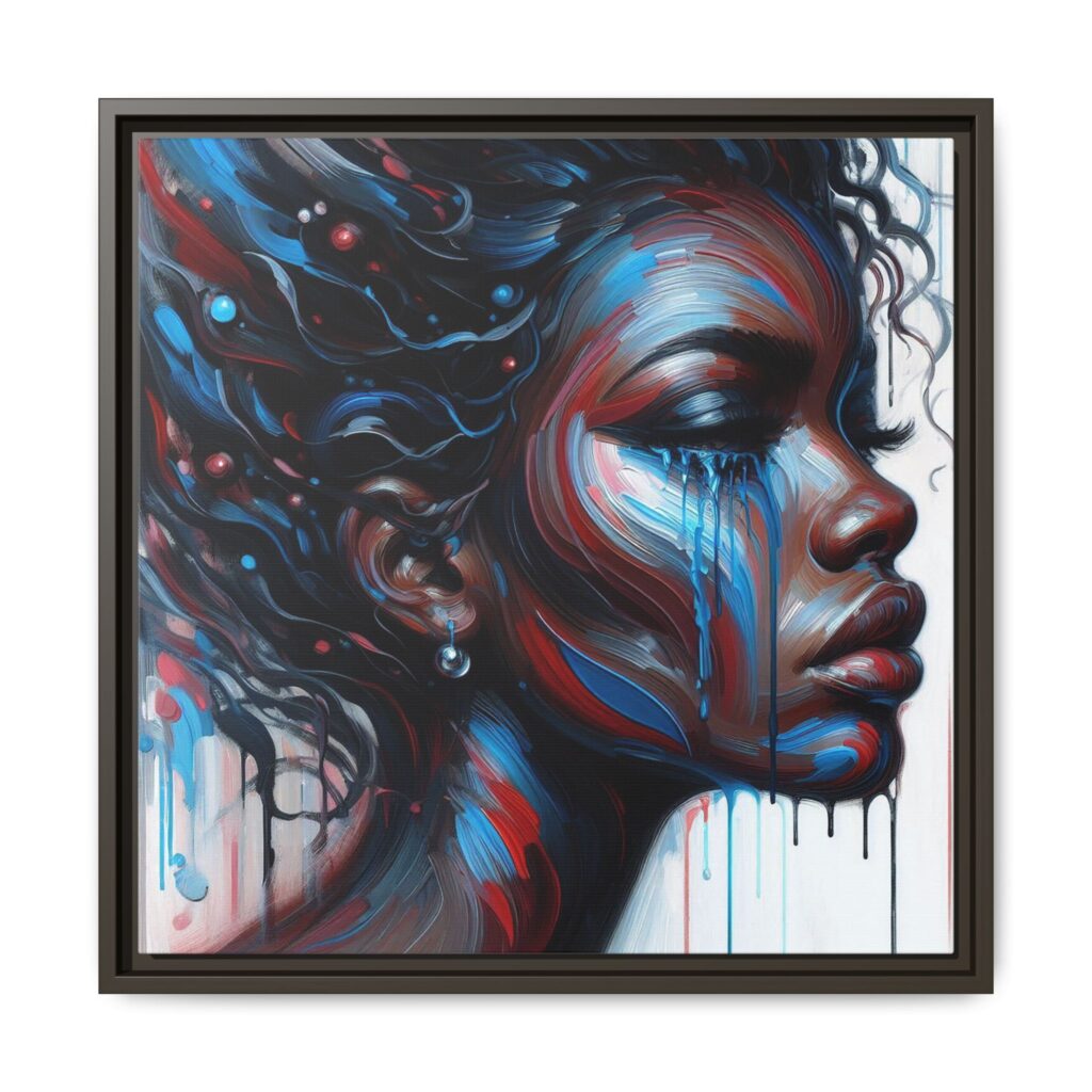
Some of the most striking pieces in the collection play with light emerging from the void.
“Midnight Rhapsody” and “Neon Sorrow” utilize deep, black backgrounds to let the colors truly pop. In Midnight Rhapsody, the texture swirls like liquid nebula, while Neon Sorrow embraces a cyberpunk aesthetic with electric blue tears running down dark skin. These pieces are perfect for modern, industrial spaces that need a focal point of intensity.
I wanted to experiment with how the eye perceives shape.
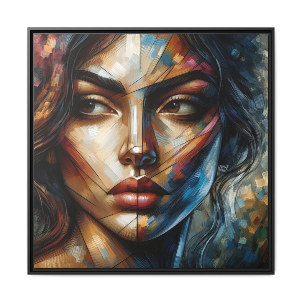
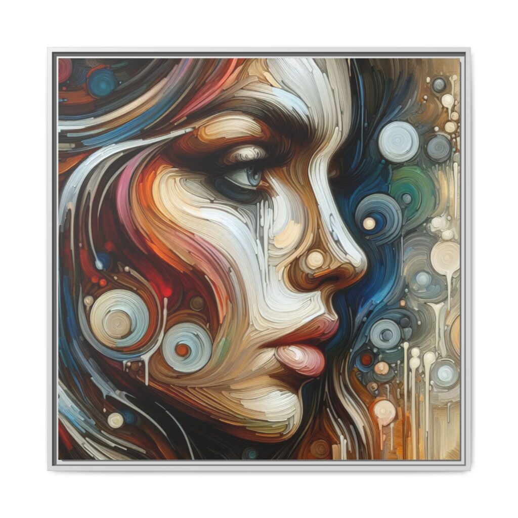
At the heart of the collection is raw emotion.
“Raw Duality” features a scratchy, rough texture that feels distressed and urgent, highlighting internal conflict. In contrast, “Crimson Nostalgia” and “Floral Cascades” offer a softer, more romantic view, with sweeping strokes and vertical drips that mimic rain on a window pane.
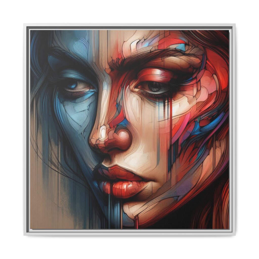
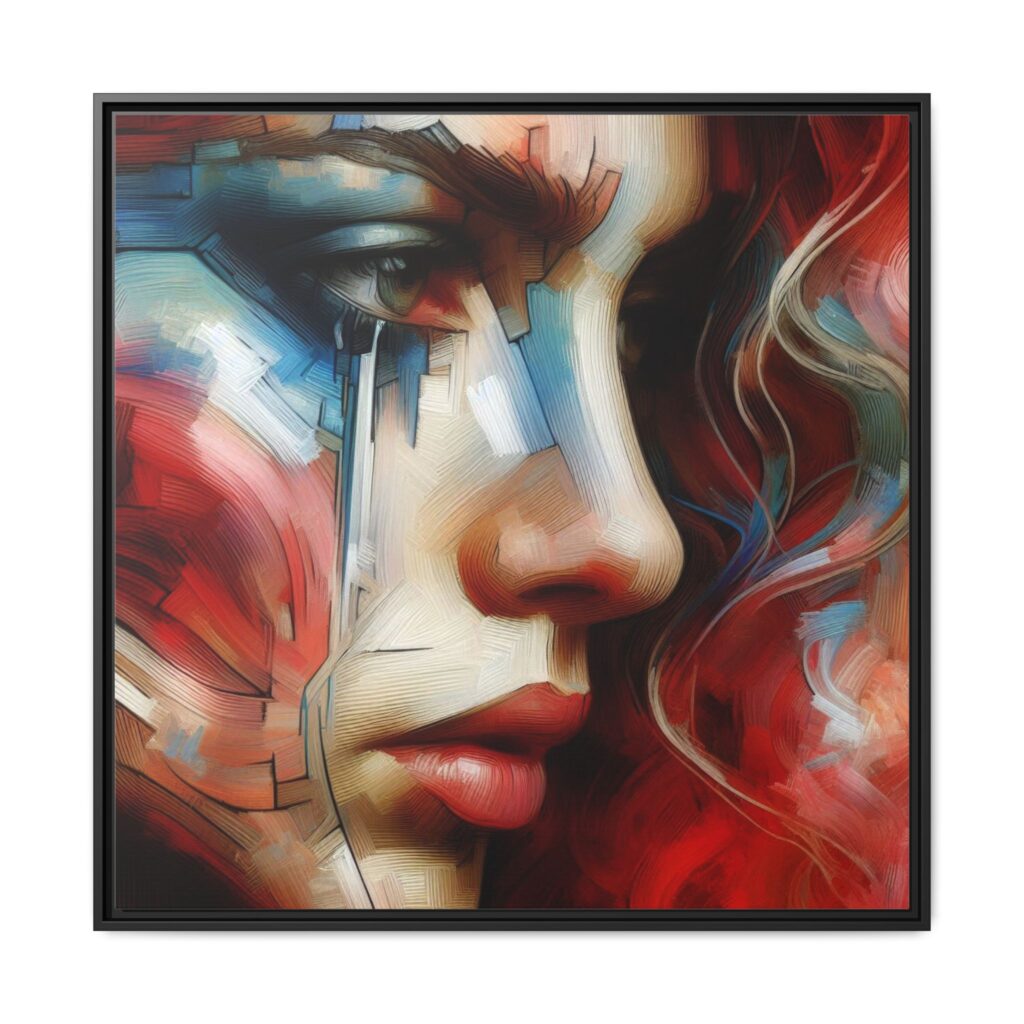
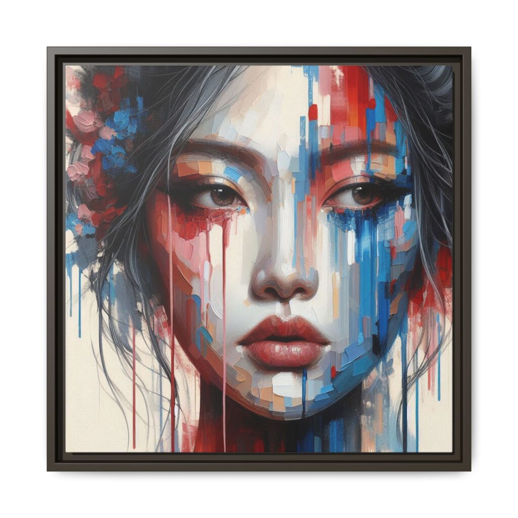
One of the reasons I love this collection is its versatility. Because the collection shares a unified color theory (Teal/Red/Gold), these pieces work exceptionally well as a Gallery Wall.
“The Fluidity of Being” is more than just a set of faces; it is a study of how texture shapes our perception of beauty.
The Introduction Art has always been about more than just capturing a likeness; it’s about
Music is emotion. It’s the soulful cry of a blues guitar, the elegant dance of
I am absolutely thrilled to announce the launch of my brand new art collection, “Digital Resonance.” This is